- Apply Tufte's principles of graphical excellence to data display
- Use Cleveland and McGill's hierarchy of graphical perception to choose appropriate encodings
- Design effective dashboards for monitoring and decision-making
- Identify and avoid common visualisation pitfalls
- Understand the role of pre-attentive processing in visual data analysis
Introduction
Data visualisation is the translation of data into visual form, and the usability of that translation determines whether the data informs, misleads, or is simply ignored. A well-designed chart exploits the perceptual and cognitive capabilities discussed in earlier chapters: pre-attentive processing for rapid pattern detection, Gestalt grouping for structure, working memory limits for complexity management. A poorly designed chart works against these capabilities, producing confusion or false conclusions. Before Tufte, Jacques Bertin's Semiology of Graphics Bertin, 1967 had already catalogued the visual variables (position, size, shape, value, colour, orientation, texture) that underpin any graphical encoding of data. A later tradition, beginning with Wilkinson's Grammar of Graphics Wilkinson, 2005 and extended by Wickham's layered grammar implemented in ggplot2 Wickham, 2010, recast charts as compositions of data, aesthetic mappings, geometric objects, and statistical transformations. That grammar now underlies most declarative visualisation tools. Munzner's analysis-oriented framework Munzner, 2014 and Cairo's treatment of the ethics of data graphics Cairo, 2016 provide complementary modern perspectives.
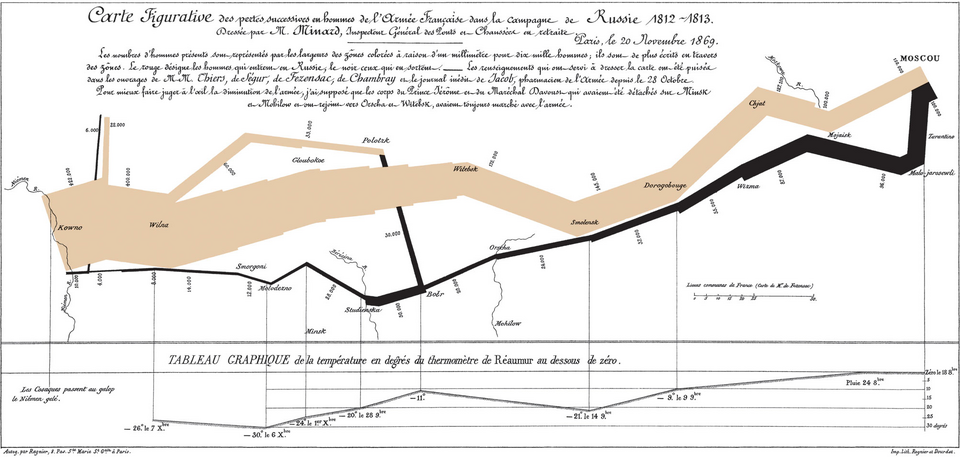
Two nineteenth-century examples are routinely held up as touchstones of effective data graphics. The first is Charles Joseph Minard's 1869 flow map of Napoleon's 1812 Russian campaign, which compresses six variables (army size, geographic location in two dimensions, direction of travel, temperature, and time) into a single coherent figure.
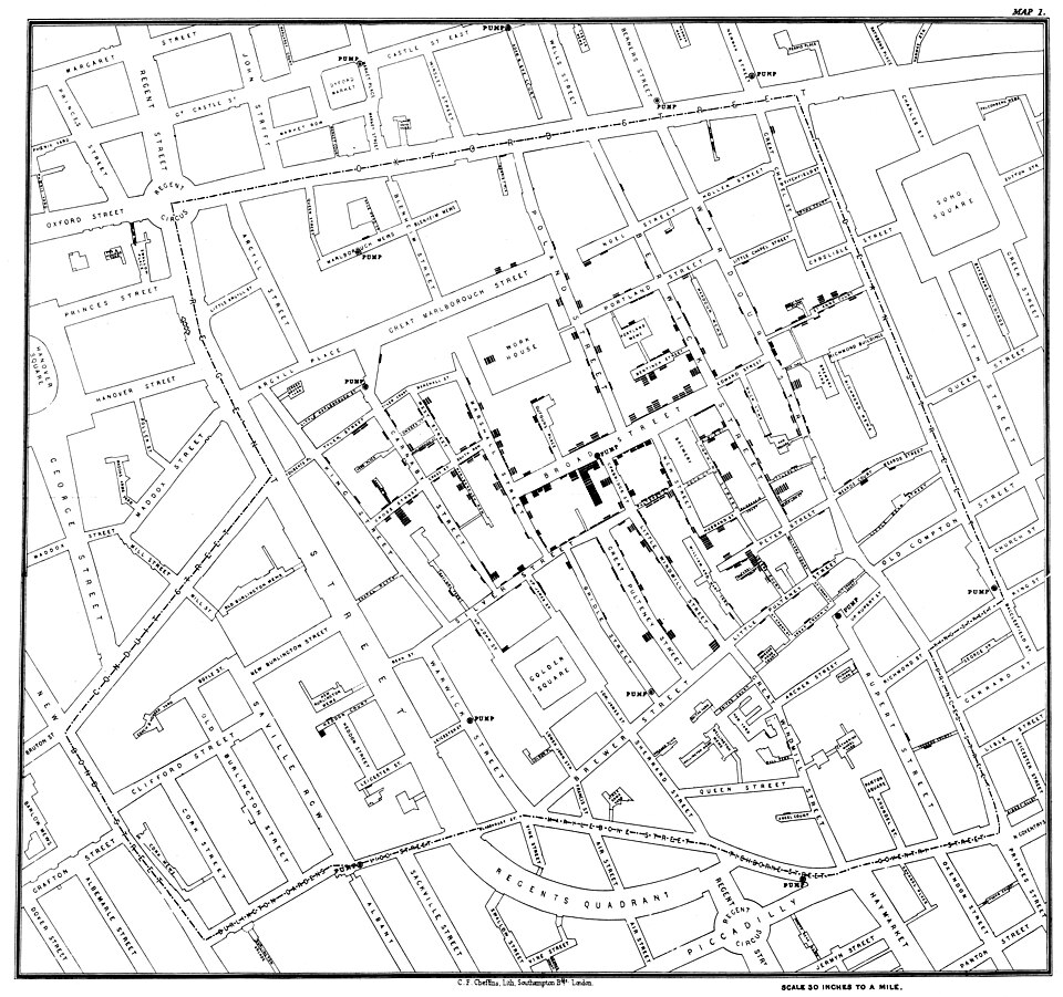
The second is John Snow's 1854 dot map of cholera deaths in Soho, which used spatial clustering around the Broad Street pump to support an epidemiological argument that cholera was waterborne rather than airborne.
Tufte's Principles
Edward Tufte's The Visual Display of Quantitative Information Tufte, 1983 established principles of graphical excellence that remain the standard reference. His central concern is the data-to-ink ratio: the proportion of a graphic's ink (pixels, on screen) that represents actual data.
Data-Ink Ratio
Maximise the data-ink ratio: every element in a visualisation should represent data or help the viewer interpret data. Remove gridlines, backgrounds, borders, 3D effects, decorative elements, and redundant labels that do not contribute to understanding. Tufte Tufte, 1983 calls these non-data elements "chartjunk." This is not aesthetic minimalism for its own sake; it is a direct application of the signal-to-noise principle: extraneous visual elements compete for the viewer's limited attentional resources (Chapter 4) and increase cognitive load (Chapter 3) Sweller, 1988.
Graphical Integrity
Tufte defines the "lie factor" as the ratio of the size of an effect shown in the graphic to the size of the effect in the data. A bar chart where doubling the data value quadruples the visual area (because the chart uses area rather than length) has a lie factor of 2. Truncated y-axes, perspective distortions, and area-based encodings are common sources of graphical dishonesty.
Small Multiples
Rather than combining many data series on a single complex chart, Tufte Tufte, 2001 advocates small multiples: a series of similar charts, each showing a different slice of the data (different time periods, different categories, different conditions). Small multiples exploit the viewer's ability to compare adjacent, identically formatted charts, a task well suited to the visual system's parallel processing capabilities Treisman, 1980.
A hospital's monthly infection rates across 12 wards can be displayed as 12 lines on a single chart (cluttered, difficult to compare) or as 12 small, identically scaled bar charts arranged in a grid (each ward's pattern immediately visible, comparisons straightforward). The small multiples approach trades screen space for clarity, a worthwhile exchange when the goal is comparison across categories.
Sparklines
Sparklines are word-sized graphics embedded in text or tables that show the trend of a data series without axes, labels, or grid lines. A table of financial data with a sparkline column showing each stock's price history over the past year communicates trend information at a glance, without requiring the reader to leave the table to consult a separate chart.
Cleveland and McGill's Hierarchy
William Cleveland and Robert McGill [Cleveland, 1984; Cleveland, 1985] conducted experiments to determine how accurately people judge different visual encodings of quantitative data. Their hierarchy, from most to least accurate, is:
- Position along a common scale (scatter plots, dot plots)
- Position along non-aligned scales (multiple scatter plots on separate axes)
- Length, direction, and angle, tied at the same level of accuracy (bar charts, slopes, pie-chart wedges)
- Area (bubble charts, treemaps)
- Volume and curvature (3D charts, curved graphical elements)
- Shading and colour saturation (heat maps)
Note that length, direction, and angle all sit at the same level in the original 1984 ordering (Cleveland and McGill did not find a reliable accuracy difference between them) and that volume is grouped with curvature rather than given its own rank.
Choose the visual encoding that provides the most accurate perception for the viewer's task. If the task is comparing exact values, use position (a bar chart or dot plot). If the task is perceiving proportions of a whole, angle (a pie chart) may suffice for simple cases but area (a treemap) is more accurate for many categories. If the task is detecting patterns in dense data, colour (a heat map) may be appropriate despite lower precision, because it scales to many data points.
The Case Against Pie Charts
Pie charts use angle and area to encode values, encodings that rank poorly in Cleveland and McGill's hierarchy. Humans are less accurate at judging angles and areas than lengths and positions. A bar chart showing the same data as a pie chart will produce more accurate readings. Despite this, pie charts remain popular because they communicate the part-to-whole relationship intuitively. When there are only 2–3 segments and the goal is a general impression of proportions (not precise comparison), a pie chart may be acceptable. With more than 5 segments, a bar chart is almost always preferable.
Pre-Attentive Features in Visualisation
Chapter 2 described pre-attentive visual features: properties processed in parallel, without conscious attention [Treisman, 1980; Healey, 2012]. Data visualisation relies heavily on these Ware, 2021:
- Colour hue for categorical distinctions
- Colour intensity for magnitude
- Size for magnitude (bubble charts)
- Position for quantitative comparison
- Orientation for directional data
Effective visualisations use pre-attentive features to make the most important patterns immediately visible. Ineffective visualisations either fail to use pre-attentive features (requiring slow, serial scanning) or use them for non-data elements (decorative colours, background patterns) that compete with the data.
Dashboard Design
Dashboards aggregate multiple data displays onto a single screen for monitoring, analysis, or decision support. Dashboard usability is a distinct challenge because the designer must balance comprehensiveness (showing all relevant data) against cognitive load (not overwhelming the viewer).
Few's Dashboard Principles
Stephen Few's work on dashboard design [Few, 2006; Few, 2009] emphasises several principles.
Fit on a single screen. If the dashboard requires scrolling, the viewer cannot maintain awareness of all displayed data simultaneously. The constraint of a single screen forces prioritisation.
Group related data. Apply Gestalt proximity and similarity to cluster related metrics. Separate unrelated metrics with whitespace or dividers.
Provide context. A number without context is meaningless. Show targets, thresholds, trends, and comparisons alongside current values. "45" is uninformative; "45 of 50 target, up 12% from last month" is actionable.
Use appropriate chart types. Bullet graphs for gauging performance against a target. Sparklines for trends. Bar charts for comparisons. Avoid gauges and dials (they waste space and provide poor precision).
Dashboard design is a cognitive load management problem. The viewer must monitor multiple data streams simultaneously, detect anomalies, and make decisions. Every unnecessary visual element (decorative chart frames, 3D effects, gratuitous colour) consumes attentional resources that should be devoted to the data. Apply the dark cockpit principle from aviation (Chapter 10): normal states should be visually quiet; only anomalies should attract attention.
Alert Integration
Dashboards often incorporate alerting: visual cues that draw attention to values outside acceptable ranges. Effective alerting uses the pre-attentive colour channel: a value that turns red pops out of a field of black/grey values effortlessly. However, alert design in dashboards faces the same challenge as clinical decision support (Chapter 12): too many alerts cause fatigue and dismissal. Dashboard alerts should be reserved for genuinely actionable conditions, with thresholds carefully calibrated to minimise false positives.
Clinical Data Visualisation
Healthcare presents specific data visualisation challenges: dense temporal data (vital signs over hours), complex multivariate relationships (drug interactions), and high-stakes interpretation (a missed pattern may mean a missed diagnosis).
Vital Signs Displays
Traditional vital signs displays show individual parameters (heart rate, blood pressure, oxygen saturation, respiratory rate) as separate numbers or waveforms. Integrated displays that combine these parameters into a single visual representation (such as a polygon whose shape changes with the patient's condition) have been shown to improve detection of physiological deterioration in simulation studies.
Medication Timelines
Medication administration involves complex temporal relationships: start times, stop times, overlapping medications, PRN (as-needed) doses, and scheduled intervals. Timeline visualisations that show medications as horizontal bars on a time axis, with colour coding by drug class and markers for administration events, support the pattern recognition needed for medication reconciliation.
Most clinical data visualisation research has been conducted in simulation studies with controlled conditions. The real clinical environment includes interruptions, time pressure, variable lighting, small screens, and competing demands for attention. How well do laboratory findings about visualisation effectiveness translate to the clinical environment? What additional design considerations arise from the real-world context?
Common Visualisation Pitfalls
Truncated Axes
Starting a y-axis at a value other than zero exaggerates differences between values. A bar chart showing satisfaction scores of 4.1 vs. 4.3 on a scale starting at 4.0 makes a 5% difference look like a 300% difference. Truncated axes are sometimes appropriate (for showing small but important changes in high-baseline data) but should always be clearly labelled.
Misleading Area Encodings
When area or volume is used to encode values, the visual impression grows faster than the data. Doubling the radius of a circle quadruples its area; doubling the edge length of a cube octuples its volume. The viewer's impression of "twice as big" does not match the data's "twice as large."
Colour Misuse
Using a rainbow colour scale (red-orange-yellow-green-blue-purple) for continuous data is a common error. The rainbow scale has perceptual non-uniformities (yellow appears lighter than other hues), artificial boundaries between colours, and is inaccessible to colour-blind viewers. Sequential single-hue scales (light blue to dark blue) or diverging scales (blue-white-red) are perceptually more uniform and more accessible.
Over-Plotting
Scatter plots with too many data points become opaque. When points overlap extensively, the viewer cannot distinguish density differences. Solutions include transparency (alpha blending), hexagonal binning, density contour plots, or sampling.
Chart Type Mismatch
Using a line chart for categorical data implies a continuous relationship between categories. Using a pie chart when the parts do not sum to a meaningful whole. Using a stacked area chart when the individual series are more important than the total. Each chart type carries implicit assumptions about the data structure; violating those assumptions misleads the viewer.
Key Takeaways
- Tufte's data-ink ratio principle: every visual element should represent data or help interpret data; remove chartjunk.
- Cleveland and McGill's hierarchy ranks visual encodings by perceptual accuracy: position on a common scale > position on non-aligned scales > length/direction/angle > area > volume/curvature > shading/colour saturation.
- Pre-attentive features (colour, size, position) should encode the most important data dimensions for rapid pattern detection.
- Dashboards are cognitive load management problems; apply the dark cockpit principle to highlight anomalies.
- Common pitfalls include truncated axes, misleading area encodings, rainbow colour scales, over-plotting, and chart type mismatches.
- Clinical data visualisation must support high-stakes pattern recognition under real-world conditions of interruption and time pressure.
Further Reading
- Tufte, E. R. (1983). The Visual Display of Quantitative Information. Graphics Press.
- Cleveland, W. S., & McGill, R. (1984). Graphical perception: Theory, experimentation, and application to the development of graphical methods. Journal of the American Statistical Association, 79(387), 531–554.
- Few, S. (2006). Information Dashboard Design: The Effective Visual Communication of Data. Analytics Press.
- Munzner, T. (2014). Visualization Analysis and Design. CRC Press.
- Cairo, A. (2016). The Truthful Art: Data, Charts, and Maps for Communication. New Riders.