- Explain Vitruvius's triad of firmitas, utilitas, and venustas and its relevance to software design
- Describe the role of proportion systems (golden ratio, classical orders) in architectural design
- Analyse Palladio's design principles and their application to interface layout
- Understand how evolved architectural practices constitute a form of design evidence
- Apply architectural design principles to the organisation of digital interfaces
Introduction
The preceding chapters drew their laws primarily from experimental psychology and information theory: controlled laboratory studies of human performance. But there is a much older tradition of design knowledge, accumulated over millennia in the practice of architecture. The architects of classical antiquity, the Renaissance, and the Enlightenment developed principles of proportion, symmetry, and organisation that were not discovered through controlled experiments but through centuries of practice, refinement, and what amounts to a cultural process of natural selection: buildings that worked were imitated; buildings that failed were abandoned. This chapter argues that these architectural principles constitute a legitimate and valuable source of evidence for design: different from experimental evidence, but complementary to it. Where Fitts's Law tells us how fast a hand can reach a target, Vitruvius tells us how spaces should be proportioned for human comfort. Both are statements about the relationship between designed objects and human beings.
Vitruvius and the Classical Foundation
Marcus Vitruvius Pollio, writing in the first century BCE Pollio, -30, articulated three qualities that every well-designed structure must possess:
- Firmitas (firmness/durability): the structure must stand up and last
- Utilitas (utility/function): the structure must serve its intended purpose
- Venustas (beauty/delight): the structure must be aesthetically pleasing
Vitruvius's triad (firmitas, utilitas, venustas) asserts that function alone is insufficient. A building (or interface) that works but is ugly, or that is beautiful but fragile, is incomplete. All three qualities are necessary and none is sufficient on its own. In software terms: the code must be reliable (firmitas), the interface must support the user's tasks (utilitas), and the experience must be satisfying (venustas).
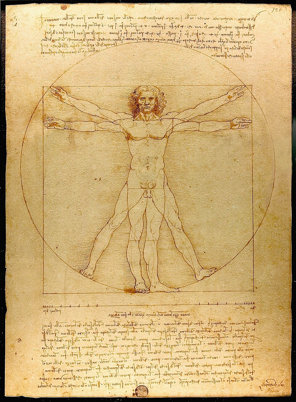
Vitruvius was explicit that these qualities serve the human being who uses the building. His discussion of temple design includes detailed measurements based on human proportions: column heights related to human stature, intercolumniation (the space between columns) scaled to the human body. The building is, in Vitruvius's conception, an extension of human proportion.
Symmetry and Eurythmia
Vitruvius distinguished between symmetry (the mathematical relationships between parts) and eurythmia (the visual impression of those relationships when perceived by a human observer). A building might be mathematically symmetrical but not appear so when viewed from certain angles, in which case Vitruvius recommended deliberate adjustments to the proportions (what the Greeks called optical corrections) to ensure that the perceived result matched the intended design.
The distinction between mathematical proportion and perceived proportion is central to design. A layout that is perfectly centred according to pixel measurements may not look centred to the human eye because of optical weight: heavy elements (dark colours, dense text) feel lower than light elements. Good design adjusts for human perception, not just mathematical precision. This is why typographers use optical kerning rather than mechanical spacing, and why designers sometimes "cheat" alignment to achieve visual balance.
The Golden Ratio and Proportion Systems
The golden ratio (φ ≈ 1.618) appears throughout classical architecture and has been claimed to underlie human aesthetic preference. The evidence for a universal preference for the golden ratio is mixed: some studies find a mild preference for rectangles with golden proportions, while others find no clear preference or preferences that vary with culture and context. What is less controversial is that systematic proportion (using a consistent ratio to derive measurements) produces visual coherence. Whether the ratio is the golden ratio, the square root of 2, or a simple modular grid, the use of a consistent system prevents the arbitrary mishmash of dimensions that makes a design feel uncoordinated.
The CSS design system used in this textbook employs golden-ratio spacing: the base unit (1rem) is multiplied or divided by 1.618 to produce a family of spacing values (0.382rem, 0.618rem, 1rem, 1.618rem, 2.618rem, 4.236rem). This is not because each individual spacing value is perceptibly "golden" but because the consistent ratio produces harmonious visual relationships throughout the page. Any consistent ratio would work; the golden ratio is a convenient and historically resonant choice.
The Classical Orders
Classical architecture recognises five orders (the Greek Doric, Ionic, and Corinthian, with the Tuscan and Composite added by the Romans and codified during the Renaissance), each defined by a complete system of proportions. The column height, diameter, spacing, entablature height, and ornament are all derived from a single module (typically the column's base diameter). This modular approach ensures that every element is proportionally related to every other. The orders are, in essence, design systems: complete specifications that produce internally consistent results. Modern design systems in software (Material Design, Apple's Human Interface Guidelines, IBM's Carbon) serve the same function: they define a module (an 8-pixel grid, a type scale, a colour palette) and derive all measurements from it.
Palladio and the Four Books
Andrea Palladio (1508–1580) codified his design principles in I Quattro Libri dell'Architettura (The Four Books of Architecture) Palladio, 1570, one of the most influential architecture treatises ever written. Palladio's buildings are admired for their clarity, symmetry, and proportion.

Room Proportions
Palladio specified seven ideal room shapes, defined by the ratio of length to width:
- Circular
- Square (1:1)
- √2 rectangle (1:1.414)
- 4:3 rectangle
- 3:2 rectangle
- 5:3 rectangle
- 2:1 rectangle
These ratios are not arbitrary; they correspond to musical harmonic intervals (octave, fifth, fourth, major third), reflecting the Renaissance belief in a deep connection between visual and auditory harmony.
Palladio's room proportions are based on musical harmonics: the octave (2:1), the fifth (3:2), the fourth (4:3). Modern screen aspect ratios (16:9, 4:3, 3:2) echo some of these proportions. Is this coincidence, or does the mathematical relationship between these ratios and human perception explain their persistence? Does a 3:2 sidebar-to-content ratio feel more "right" than an arbitrary ratio, or is this a culturally learned preference?
Symmetry and Hierarchy
Palladio's buildings are organised around a central axis, with rooms arranged symmetrically on either side. The largest, most important room occupies the centre; subsidiary rooms are smaller and arranged hierarchically. The entrance provides a clear visual axis that draws the visitor inward. In interface design, the analogy is direct: a well-structured page has a clear visual hierarchy (the most important content is largest and most central), a logical organisation (related elements are grouped), and a clear entry point (the user's eye is drawn to the right starting point).
The Portico and Threshold
Palladio's buildings typically feature a portico: a formal entrance that marks the transition from exterior to interior. The portico serves both a functional purpose (shelter) and a psychological one (signalling arrival, creating a sense of entry). In software, the equivalent is the landing page, the login screen, or the onboarding flow. These thresholds orient the user, set expectations, and create a sense of entering a defined space. A well-designed threshold reduces disorientation; a poorly designed one (or its absence) drops the user into the middle of an interface without context.
James Gibbs and Rules for Drawing
James Gibbs (1682–1754), the Scottish architect responsible for St Martin-in-the-Fields in London and the Radcliffe Camera in Oxford, published Rules for Drawing the Several Parts of Architecture Gibbs, 1732. Unlike Palladio's theoretical treatise, Gibbs's book was a practical manual: a set of rules that a builder of moderate skill could follow to produce classically proportioned buildings. Gibbs's contribution was the democratisation of design knowledge: converting the implicit expertise of master architects into explicit rules that could be followed by anyone. This is precisely what design systems, pattern libraries, and heuristic checklists do for software design: they codify expert knowledge into forms that non-experts can apply.
The value of design rules (whether Gibbs's architectural rules or Nielsen's heuristics) lies not in their infallibility but in their ability to raise the baseline. A builder following Gibbs's rules will produce a better building than one working from intuition alone. A developer following usability heuristics will produce a better interface than one working without them. Rules do not replace expertise, but they make competent design accessible to a wider audience.
Christopher Alexander and the Pattern Language
Of all the architects in this chapter, Christopher Alexander (1936–2022) is the one whose work has had the most direct influence on software design. In Notes on the Synthesis of Form Alexander, 1964, Alexander set out a theoretical account of design as the resolution of competing requirements: a search for a form that simultaneously satisfies all the forces acting on it. In A Pattern Language Alexander, 1977, co-authored with Sara Ishikawa, Murray Silverstein, and colleagues at the Center for Environmental Structure, he translated that theory into practical guidance: a collection of 253 interlocking patterns, each describing a recurring problem in building and town design together with the core of a solution that could be reused in countless variations. Alexander's patterns range across scales, from the layout of regions ("The Distribution of Towns," "Mosaic of Subcultures") through the arrangement of buildings ("Building Complex," "Wings of Light") to fine-grained details ("Window Place," "Alcoves," "Stair Seats"). Each pattern names a recurring situation, describes the empirical observation or experience that motivates it, and offers a generative rule rather than a fixed prescription. The patterns are explicitly connected to one another: larger patterns are elaborated by smaller ones, and the collection forms a loose grammar from which a designer can assemble a coherent whole. This idea (that design knowledge can be captured as a network of interrelated, named, reusable patterns) was taken up almost directly by software engineering and HCI. The "Gang of Four" book Design Patterns Gamma, 1994 borrowed Alexander's structure and terminology for object-oriented software; Ward Cunningham and Kent Beck's work on programming patterns and the first wiki drew explicitly on A Pattern Language; and the HCI community has produced numerous pattern libraries (Tidwell's Designing Interfaces Tidwell, 2020, Van Welie's pattern collection, Yahoo!'s Design Pattern Library, and the living pattern libraries maintained by modern design systems such as Material and Carbon). The idea that a usable interface is an assembly of well-understood, named components each resolving a recurring tension between conflicting requirements is Alexander's contribution, borrowed and adapted.
A design pattern, in Alexander's sense, is not a template to be copied verbatim but a generative rule: a named, reusable solution to a recurring problem, to be adapted to each specific context. This distinction matters. Used well, patterns raise the baseline of design (as Gibbs's rules did for builders) while preserving the designer's judgement about context. Used badly, they become templates applied without thought, and produce interfaces that are superficially consistent with convention but poorly matched to the actual user and task. The skill of working with patterns is knowing when to apply, when to adapt, and when to break them.
Alexander's later work went further, arguing in The Timeless Way of Building Alexander, 1979 and the four-volume The Nature of Order (2002–2005) that good design exhibits a property he called "the quality without a name": a felt rightness that arises when a structure is alive with the appropriate patterns resolved together. Whether one accepts this mystical framing, the underlying empirical claim is testable and important: certain structural properties of designed environments reliably correspond to human well-being. For a textbook arguing that usability is an applied science, Alexander's patterns are a direct ancestor: an attempt to codify, in a form that can be taught and reused, knowledge about what makes designed environments work for the humans who inhabit them.
Architectural Principles Applied to Software
Hierarchy and Spatial Organisation
Architecture organises space hierarchically: public rooms are larger and more prominent; private rooms are smaller and more secluded. Circulation paths (corridors, stairs) connect them. In software, the information architecture serves the same function: navigation structures, page hierarchies, and content organisation create a spatial structure that users navigate.
Wayfinding
Kevin Lynch's The Image of the City Lynch, 1960 identified five elements that people use to navigate urban environments: paths, edges, districts, nodes, and landmarks. These same elements appear in software navigation: breadcrumbs (paths), borders and dividers (edges), grouped sections (districts), hub pages (nodes), and distinctive visual features (landmarks).
Rhythm and Repetition
Classical architecture achieves visual rhythm through the repetition of elements (columns, arches, windows) at regular intervals. This rhythm creates visual coherence and makes large structures comprehensible. In interface design, consistent spacing, repeated component patterns, and regular grid structures serve the same function.
The Relationship Between Ornament and Structure
The modernist architect Adolf Loos declared "ornament is crime" (1908); the postmodernists restored decorative elements. The debate mirrors a tension in interface design between minimalism (remove everything non-essential) and expressive design (visual richness enhances engagement and delight). The classical position (Vitruvius's) is that ornament should be structurally honest: it should reveal or emphasise the underlying structure, not disguise it. A column capital is ornamental, but it marks the structural joint between column and entablature. Applied to interface design: visual embellishments are appropriate when they reinforce the structure and hierarchy of the information; they are harmful when they obscure it.
Evolved Practice as Evidence
The architectural principles discussed in this chapter were not discovered through controlled experiments. They evolved through a process analogous to natural selection: buildings were designed, lived in, evaluated by their inhabitants and successors, and either imitated or abandoned. Over centuries, this process filtered out designs that failed to serve human needs and preserved designs that succeeded. This evolved practice constitutes a form of evidence: not experimental evidence with controlled variables and statistical significance, but observational evidence accumulated over a very large number of trials (buildings) and evaluated by a very large number of judges (inhabitants) over a very long period (millennia).
Evolved design practices (architectural proportions, typographic conventions, wayfinding patterns) represent accumulated evidence about what works for human beings. They should not be dismissed simply because they were not derived from controlled experiments. Equally, they should not be accepted uncritically: the context in which they evolved may differ from the context in which they are being applied. The strongest design decisions draw on both evolved practice and experimental evidence.
Key Takeaways
- Vitruvius's triad (firmitas, utilitas, venustas) asserts that good design requires durability, function, and beauty: all three are necessary.
- Systematic proportion (golden ratio, modular grids, classical orders) produces visual coherence; the specific ratio matters less than its consistent application.
- Palladio's principles of symmetry, hierarchy, ideal proportions, and formal thresholds have direct parallels in interface design.
- Gibbs's contribution was democratising expert design knowledge through explicit rules: the same function served by modern design systems and heuristics.
- Christopher Alexander's pattern language (A Pattern Language, 1977; Notes on the Synthesis of Form, 1964) provided the intellectual model for HCI design patterns, software design patterns, and modern design systems.
- Architectural principles (hierarchy, wayfinding, rhythm, honest ornament) apply directly to the organisation of digital interfaces.
- Evolved architectural practices constitute a form of design evidence complementary to experimental research.
Further Reading
- Vitruvius. De Architectura (c. 30 BCE). Trans. M. H. Morgan (1914). Harvard University Press.
- Palladio, A. (1570). I Quattro Libri dell'Architettura. Trans. R. Tavernor & R. Schofield (1997). MIT Press.
- Gibbs, J. (1732). Rules for Drawing the Several Parts of Architecture. London.
- Lynch, K. (1960). The Image of the City. MIT Press.
- Alexander, C. (1964). Notes on the Synthesis of Form. Harvard University Press.
- Alexander, C., Ishikawa, S., & Silverstein, M. (1977). A Pattern Language: Towns, Buildings, Construction. Oxford University Press.
- Gamma, E., Helm, R., Johnson, R., & Vlissides, J. (1994). Design Patterns: Elements of Reusable Object-Oriented Software. Addison-Wesley.
- Lidwell, W., Holden, K., & Butler, J. (2010). Universal Principles of Design (revised ed.). Rockport Publishers.